Behind the Pattern - Migrating Cranes
Share
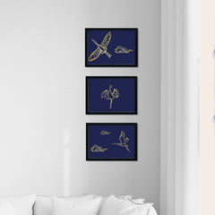
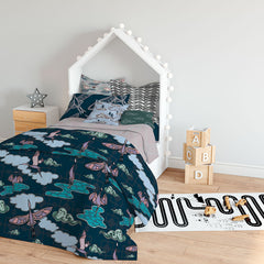
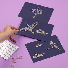
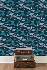
It’s been a little while since I’ve done one of these for the blog but, given they launched last month, I thought giving the background behind the Migrating Cranes art prints and pattern collection seemed the timely thing to do! Truth be told the art prints have been on my to-do list for an age, but I couldn’t quite get them right, but once I’d tried the foiled print for the Kickstarter campaign I knew that was what I had to do. Well my gut did, my head had a total wobble and nearly didn’t send off the artwork, but I did and I’m so glad! The motifs for the art prints are actually taken from drawings I did for the pattern collection, so although they may seem quite simple at first glance, actually there’s a collection of prints behind them!
THE BRIEF
The original brief was ‘Eastern Delights – Ornate Repeats‘ from the 2019 Winter School run by Make It In Design. The brief included a range of truly luscious images and key words and my first thoughts were of crane images and chinoiserie which have fascinated me since my first visit to Brighton’s Royal Pavillion. I wasn’t going to go quite for the excess of the Pavilion, as joyous as that would have been to work on, but once the idea was lodged in my head that was the only way I could take the brief.
THEME/MOTIFS
I’ve always been struck by how poised and sculptural cranes can be. Woodblock printing from Japan and chinoiserie, as I mentioned before, just enhanced it as they can be so simple and yet so expressive. I’d also be developing a wire-frame style of drawing around the same time, based on silver-smithing and wire jewellery so following initial line drawings I broke them down further as I might if I was laying wire out ready to solder.
COLOUR PALETTE
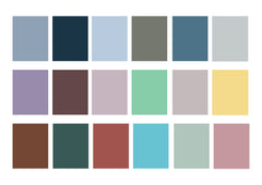
Given that it was part of the Winter School brief I was lucky enough to have the colour palette provided for me. As always it was an option not to go with what they include in their trend based brief, but personally I like the challenge of working with a palette that I might not necessarily have chosen myself. If It had been me I think the colours would have been a bit lighter, and certainly might have had some brighter accent colours, but being out of my comfort zone and forcing myself not to go down that route with my own colour choices made it a more interesting process.
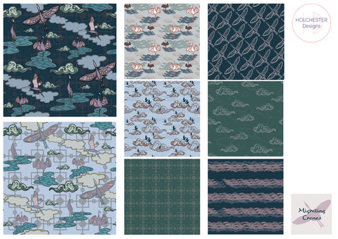
THE COLLECTION
Overall there aren’t quite as many patterns in the collection as I’d have liked, and unfortunately some fell victim to a hard-drive and backup failure last winter too. But even nearly 2 years later I do still love the patterns I have got from the brief, and I’m over the moon with how the foiled prints which were derived from it have turned out. I’d love to see these fabrics together in a quilt, something which was suggested to me and now it has been I can’t get out of my head. Certainly an eastern inspired quilt pattern could look smart with these fabrics mixed together.
AND DID THEY LIKE IT…..?
Well the pattern collection has certainly received some lovely comments, although it’s not been submitted to a client and in all honestly it’s been a bit neglected since it was first designed. As for the prints, however, they have been a popular products and photos and comments I’ve received from customers confirm that they agree they’re elegant (and that the gold is tricky to photograph!).
