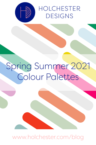
Spring and Summer 2021 Colour Palettes
For this next set of seasonal colour palettes I’ve decided to pull together spring and summer. Two reasons really. I did actually start working on Spring relatively early but time ran away with me a little bit. And then, once I’d started working on summer too I thought it might be interesting to see them alongside each other and see how my mind has moved through the seasons.
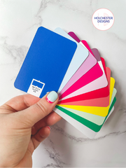
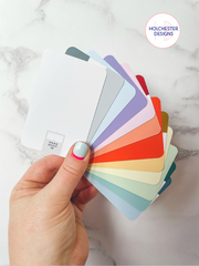
As chance would have it I also got a new swatch packs - called Swatchos* and I LOVE them - as since I've been having so much fun playing with the deck this seemed like the perfect opportunity to show them off.
Spring for me was very much about bold and vibrant colours, especially coming out of the endless (sometimes overwhelming) grey of a lockdown winter. I don't mean all-out neon bold, but I was massively drawn to colours that are fresh, dewy and with an intensity from the excitement that it Spring had finally arrived. And yes, I realise in the UK we had one of our coldest and wettest Mays for decades so there were definitely chunks of time when spring was teasing us.
Knowing that summer was on the horizon also made me feel a bit nostalgic this year for summer's past - thinking back to Cornish coastlines at dusk (in my early 20s), hazy Lake District evenings (midge-dodging), and even that feeling of post-exam freedom. I couldn't tell you exactly why but I would hazard a guess that the lockdown restrictions easing and feeling that bit free-er may have something to do with it.
Colour palette choices for me are so often governed by the senses and the feelings I want to evoke when I look at the artwork, and it's no secret that colour theory is a big influence and interest of mine. It may not have the same effect on everyone, which is actually one of the most fascinating aspects of it, but chances are it won't be too wide of the mark either if you stopped to dissect how you responded to them.
SO WHAT DO YOU THINK? HAVE I NAILED SPRING AND SUMMER PALETTES FOR YOU, OR AM I WAY OFF?
IS YOUR TAKE ON SPRING GREENER AND BRIGHTER, OR IS YOUR SUMMER MORE INTENSE?
* So, Swatchos. Just so there isn’t any confusion I was 100% influenced by another designer to buy my own set of Swatchos - they weren’t gifted or anything like that. They’re credit card sized, have all the colour codes on and are a great way to play with bringing colours together that isn’t a Pantone book (which isn’t necessarily budget friendly). If you fancy finding out more or ordering your own set then here are all the key links for you!
W: https://www.printhandbook.com/products/swatchos
IG: https://www.instagram.com/swatchos/