Spring 2023 Colour Palette
The next season is here (apparently, I still had to de-ice the car this morning in late April!) and it’s got me thinking about the next colour palette for this series.
As always these palettes are led by own senses in reaction to the seasons and what colours those bring to mind, instead of being, like many palettes, the result of trend forecasting etc. (And as fabulous as being trend-led can be, that’s never been my forte).
For me personally this Spring has felt much brighter and confident than the last few years. My word of the year has been ‘Bold’ and it’s felt quite fitting from a colour perspective. My eye has constantly been caught by bold risograph prints, punchy typography with strong lines, textures, lots of contrasts and a general sense of lightness, brightness and confidence. In fact if you did wish to see what had been catching my eye I have put them together in a Spring Colour Palettes & Inspiration Pinterest Board (my favourite place to keep together visual references).
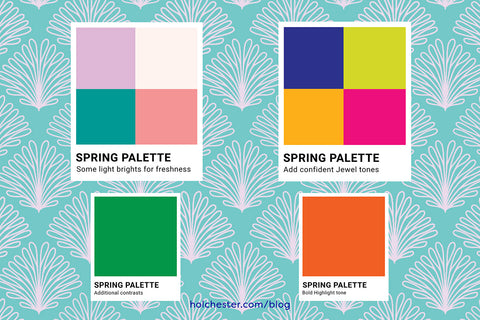
Although bold and bright have been key words for me this season, that’s not to say everything is just saturated colour. Contrast is key to stopping the palette feeling too heavy and laden, which absolutely isn’t how a Spring colour palette should feel. And the same goes for textures - a solid Acrylic piece of furniture with rounded edges next to tufted or quilted textiles. (Emily Van Hoff’s work is perfect for this sort of contrast).
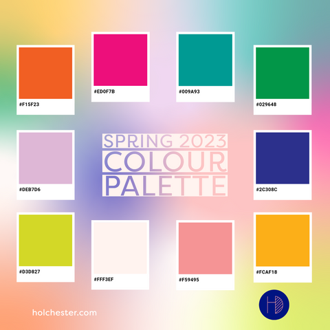
So here’s my palette for this season, along with the Hex codes in case you want to use it yourself in something! And if you do do let me see what you do, either directly or via an Instagram Tag @holchesterdesigns
And Don’t forget you can pin me to your own Pinterest Boards to refer back to later too!


